 Data visualization can be a powerful tool to gain a clear perspective of financial success and future expectations.
But reading financial reports and combing through unfiltered data is not only time-consuming but entirely unfamiliar to those of us who aren’t accounting experts. Drawing conclusions by reading raw data just isn’t the best way to make financial decisions. The good news is, there is a better way.
To tell your financial story and make it easier for your stakeholders to understand, consider using data visualization. Data visualization translates data into a picture. Seeing numbers converted to graphs, charts, mind maps and other representations makes it easier for your audience to digest the information and, in turn, make better business decisions.
Many people consider themselves to be visual learners. Presenting static data in the form of pie charts instead of an Excel spreadsheet makes sense. Using data visualization reduces the chances of your audience misinterpreting the data and ensures your company’s decision making is backed by accurate comparison and results.
Bulk data can be especially painful to analyze without visual aids, and this can present an issue when there is a time restraint on important decisions. In many businesses, time is literally money, and that’s especially the case if you have to follow trends and quickly adjust to new client needs.
In an Accenture survey of 900+ financial pros, including CFOs, 81% of the respondents believed that data storytelling is a crucial skill for any finance professional.
Being able to transform the data from tedious numbers to a coherent picture is crucial for agile business leaders and their decision-making process. Leveraging visualization to explain data analytics is particularly important when the reports have to be user-friendly due to an audience that’s not particularly finance-savvy.
Data visualization makes it very easy to recognize patterns or identify red flags throughout your organization’s finances. It can help you discover which processes or products work and are profitable, and which ones work at a loss or need optimization.
A typical financial report or statement contains hundreds, if not thousands, of numbers that all correlate and form one big picture. Using data visualization helps you filter the data and cancel out the unnecessary noise. It makes it easier for finance professionals to spot inefficiencies and make strategic and tactical decisions. Accurately measuring progress and growth is crucial for any financial plan. Data professionals are trained to compare and contrast the data to find the most logical and efficient solutions.
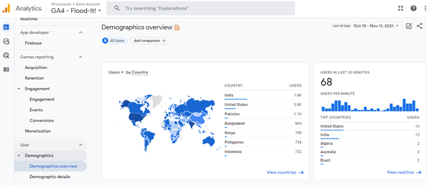
Today, advanced data visualization tools such as interactive and real-time analytic dashboards (think Google Analytics) can analyze the data and create visual aids like charts and graphs. With this, you get automatic key performance indicators (KPIs) and a better idea of your company’s strengths and weaknesses.

An essential role of data visualization in financial planning is highlighting where you can cut costs and optimize future processes. You can portray and analyze every income and expense with data visualization tools, from recruitment to taxes.
For instance, you could track and visually compare recruiting efforts throughout different channels and see what works and what doesn’t. Or, you could calculate your current and future overhead expenses at a glance.
And it’s not just the company that benefits from data visualization but employees as well. For example, using a paystub generator provides your employees with an automated pay stub each month. This allows them to see the exact amount of money that is depositing into retirement plans or their benefits. Just like organizations benefit from this knowledge, individual employees can take this data into account when making personal financial decisions.
Of course, there are multiple data visualization techniques that businesses can leverage. But there are two specific approaches that are effective at showing the big picture: explorative and explanatory (or narrative).
Data professionals will understand how to combine the two approaches to create a compelling story that engages and informs an audience of any background. And that’s the gist of effective data visualization. It should require no explanation and be perfectly understandable by all audiences.

What can a business do to improve its productivity? To answer this complex question, you always need to gather the data first, analyze it and present it in a way that clarifies what needs to be improved. Data visualization is a great way to translate the numbers into pictures and present financial reports and analyses that are easy to understand at first glance.
Gathering data is the easy part. It’s reading that data, analyzing it and drawing the correct conclusions that matter. Accurate right findings will bring forward the right decisions and action steps. So, don’t be afraid to get creative and turn your boring black and white numbers into colorful charts and visually stimulating prompts.
Businesses are collecting all sorts of data today. The ones that succeed know how to read the data, extrapolate important finding and make inferences. The key is being able to present data findings in a way that makes sense to everybody. Utilizing data visualization is the way to do that.
CompTIA Data+ covers the skills you need in data analytics. Start gaining skills like data visualization, data mining and more with CompTIA CertMaster Learn + Labs for Data+. Sign up for a free trial today!

Samantha Clark is a Warrington College of Business graduate and she works for the professional accounting firm - ThePayStubs. She handles all client relations with top-tier partners and found her passion in writing articles on various finance and business-related topics.
Read more about Data and Analytics.
Tags : Data and Analytics